Farming with Flair

•May 27, 2023 • Leave a Comment

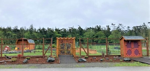
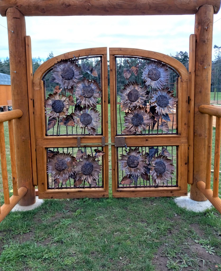
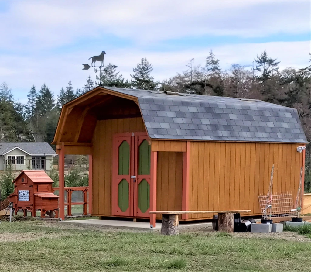
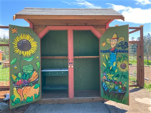
After working several times with a delightful couple to select interior colors for their beautiful seaside log home, they had the opportunity to purchase additional land. When they purchased the land Betsy and Jon had a vision from the beginning of making it a farm with a vegetable stand where their bounty could be shared with neighbors and friends. They don’t do anything by halves so believe me, they’ve created quite a unique, beautiful and productive farm that will also be used as a venue for outdoor events. I was involved in the early stages when they brought in a small “barn” structure and had a farm stand built to display produce. We selected a color palette with some whimsy (because why not, it’s a farm) and they took it from there. The finished product involved many people to complete it, in addition to Betsy and Jon’s consistent vision (and unrelenting energy!) Much creativity and effort went into this project and the results are impressive. My husband and I attended the first Sea Dog farm party (food, drinks, open mic music and a general air of celebration) and were so happy to see the completed project which has turned out beautifully. Betsy and Jon you did a great job, hats off to you!

Island living

•February 21, 2020 • 1 Comment

Island living can be pretty sweet, especially when you have such a lovely setting. These photos show the new exterior colors of a home in just such a place. The colors of nature abound and the house fits beautifully into its surroundings without stealing the show from mother nature herself.

This slideshow requires JavaScript.

Fun and Colorful

•November 15, 2019 • Leave a Comment

I love the projects I get to do for Whitman College in Walla Walla, WA. This was an exterior repaint for a vintage house where students who share a passion for community service live. They wanted it to be fun and colorful and you can see from the ‘before’ photos it was not. Take a look at what it was transformed to, it’s now one of my favorite houses I’ve done for them!

This slideshow requires JavaScript.

Your house has feelings!

•December 4, 2018 • Leave a Comment

Your house truly has the ability to convey a feeling. It can come from a number of things such as location, architectural style or furnishings but another huge influence is the colors you choose. Colors evoke a visual response but they also evoke a strong emotional response. Warm colors (colors influenced by yellow, orange, red or warm purple) create a feeling of warmth, comfort and optimism whereas cool colors (colors influenced by blue, green and cool purples) create a feeling of calm and relaxation. Your response to color is unavoidable as it happens subconsciously at an almost DNA level and is in large part responsible for how we feel in an environment. When colors are carefully considered and used in a beautiful way they create environments we love to be in and we tend to love the colors for much longer than colors selected for example because they are the current “trend” colors. Since color is one of the most cost-effective ways to change a home’s impression it makes sense to take it seriously. A gallon of ugly costs the same as a gallon of beautiful so buy the beautiful” is my advice about paint. Let me know if I can help!


From blah to aaaaah!

•September 7, 2018 • Leave a Comment

I recently worked with a client who loves color and has a fairly lively color personality. Wanting her house to reflect this, she was ready to move away from gray and white and into something with some personality. She is not afraid of bold colors (if she loves them) and I worked with her to select the colors you now see. The house was painted while away on vacation and she was very happy with what she came home to!

This slideshow requires JavaScript.

Hard work has its rewards

•July 16, 2018 • Leave a Comment

I’ve shared my involvement in the historic Worthington House renovation project in previous posts and I am so happy to be part of such a wonderful effort to preserve something really special to the small community of Quilcene, located on the beautiful Olympic Peninsula. So many talented people have donated countless hours of their time and efforts to giving this beautiful old Victorian mansion new life. They deserve to be rewarded…and they have! The project has received the 2018 State Historic Preservation Officer Award for Stewardship citing it being “a shining example of tireless stewardship.” Follow this link to see the article published in the Washington State Historical Society’s magazine: Columbia-The Magazine of Northwest History, Summer 2018

Congratulations to all of you on a job well done!

Whimsical colors for historic architecture

•May 19, 2018 • Leave a Comment

I took a look down memory lane at some of my favorite projects for Whitman College in Walla Walla, WA recently. I have had the great privilege over the years of taking some rather ordinary looking (but authentic historic) houses and transforming them with color. Whitman College has purchased houses on and adjacent to campus that are used as “interest” houses that students may live in who share a passion for that particular interest. I have so much enjoyed working with the Director of Residence Life and Housing who appreciates color and has always been open to my ideas. Since these are not private residences the use of color can stretch the limits a bit and still be appropriate; I’m not so bold with private residences unless that’s what the client wants…well maybe! Which one do you like?

This slideshow requires JavaScript.


Yesterday meets today

•May 7, 2018 • Leave a Comment

Many of today’s homes have open floor plans where rooms flow together creating a feeling of space that is wonderful for casual entertaining and conversations. The floor plans of many older homes (pre-1960’s) are more compartmentalized and the rooms in the main living areas are more often separated from each other. If the home is original construction the details of period construction can be quite charming with wood work, built-ins and the use of other building materials that would be very  expensive to build today.  I worked recently with a client who had purchased an original condition farm house overlooking the water on a lot that is quite spacious compared to the newer construction homes around it. They took on the job of remodeling it to make it functional by today’s standards, bringing the kitchen and bathrooms up to date while keeping as much of its original charm as they could. They wanted the home to have some visual variety while feeling harmonious and connected and the solution came from using different soft colors focusing mostly on neutrals. This allows the owner to use color pops where desired so the individual spaces can have their own “personalities” so to speak. Take a look at some of the rooms in this charming old home as they look now.

This slideshow requires JavaScript.

New colors for a Victorian Mansion

•January 24, 2018 • Leave a Comment

Progress is being made on the renovation of the Worthington House, a Victorian Mansion built in 1982 that I introduced in earlier posts. It has been the collaboration of a number of talented and dedicated people, many of whom are donating their time to see the project completed. I worked with them on establishing the exterior colors and I am happy to show you some progress! The five colors used are authentic historic colors carefully placed to enhance the architectural details of the exterior. In short, I want you to truly notice the beauty of the house by drawing your eye to things you might not otherwise notice. I think she’s a pretty beautiful old lady, see what you think!

This slideshow requires JavaScript.

Opposites attract? (or not)

•October 13, 2017 • Leave a Comment

Here is the image of a traditional color wheel. It shows how colors are organized and how colors change by combining them, for example if you combine blue and green you get blue-green. Every year the major paint companies announce a ‘Color of the Year’ they’ve selected as a trend color and you can count on seeing it pop up in a myriad of places encouraging you to use it. The two paint companies I deal with the most are Benjamin Moore and Sherwin Williams, last year Benjamin Moore’s Color of the Year was 2117-30 Shadow (a very dark gray with a purple blush) and Sherwin Williams’ Color of the Year was SW6039 Poised Taupe (a fairly dark shade between brown and gray.) Both colors are neutral and understated so can be used in a range of applications.

Before I go on let me tell you I don’t design to color trends. I believe the color forecasters and promoters do it at least in part to keep us dissatisfied with what we have so we always want something different. The foundation of my work is color psychology, using the understanding of how we respond to color at an innate level to create environments that please us and feel good to be in (and for a long time!) Enter now the newly announced ‘2018 Color of the Year’ for Benjamin Moore and Sherwin Williams. Benjamin Moore has selected AF-290 Caliente , a very bright and intense warm red (made from red-orange on the color wheel) and Sherwin Williams has selected SW6496 Oceanside, a deep and vivid blue-green. If you look at the positions of red-orange and blue-green as they sit on the color wheel you’ll see they are exact opposites (in color world this can also be called ‘complementary’ or ‘high contrast’ colors.) I find this intriguing that two of the largest paint companies have chosen colors that couldn’t be more opposite and bright to boot! Be prepared to hear the virtues of both of them, but before you run out and buy the paint be aware that we tend to tire of vivid colors sooner, they don’t always harmonize with other colors well and trend colors can look dated quickly. I don’t mean to dissuade you if they are just the colors you’ve been looking for but don’t jump on the band wagon just because they want you to.

If you’d like to take a peak at the new colors follow these links:

Benjamin Moore: https://www.benjaminmoore.com/en-us/color-overview/color-collections/color-trends-2018

Sherwin Williams: https://www.sherwin-williams.com/homeowners/color-forecast/color-of-the-year